
Contents
Why User Accessibility Matters in Website Design For NDIS Providers
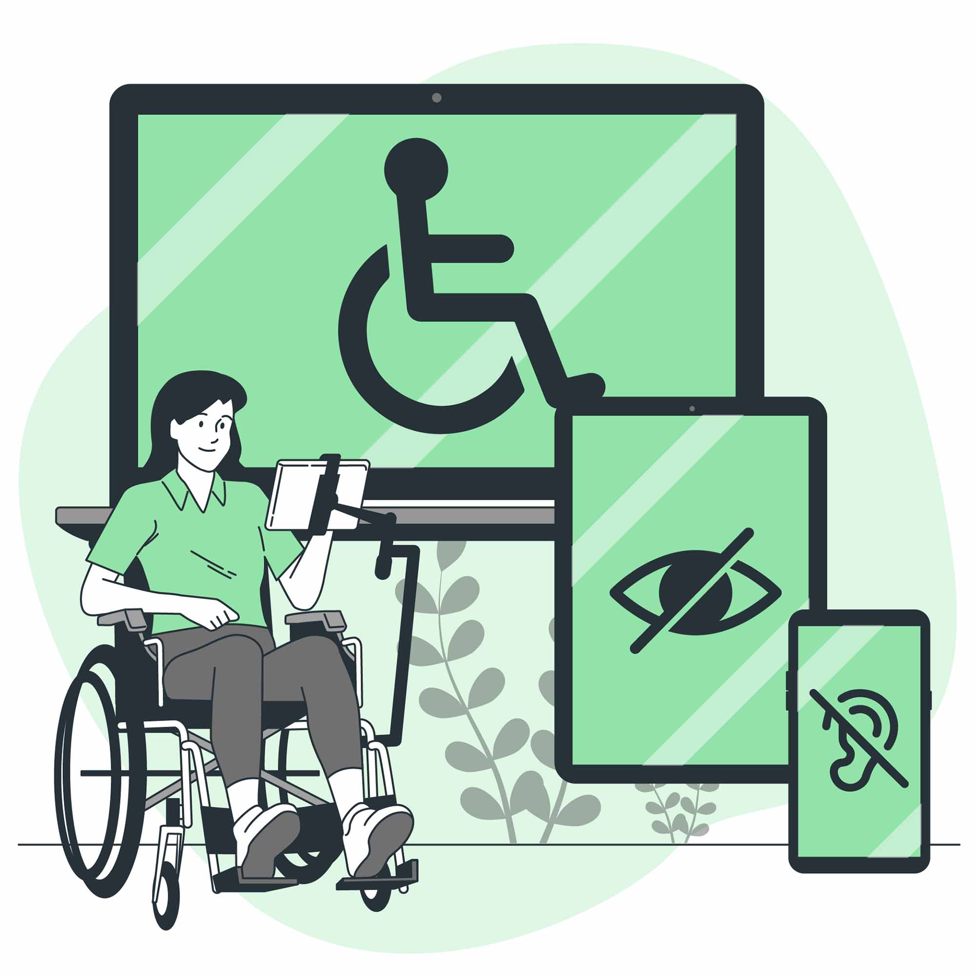
In today’s digital-first world, your website is often the first point of contact for people seeking services—especially within the healthcare industry and businesses related to the National Disability Insurance Scheme (NDIS). This includes individuals with disabilities who may be interested in your services. This is why information accessibility is more important than ever to connect with a broader audience.
Accessibility in website design isn’t just about meeting standards—it’s about inclusion, empathy and providing equal opportunities for users, regardless of their abilities. This is especially important for healthcare and NDIS providers in Australia. The people you serve may have diverse needs, and ensuring your website accommodates those needs reflects your commitment to empowering them.
This blog article will cover all the essential information and factors that Kode Digital has to share when creating a website that accommodates people with dyslexia, with a particular focus on website design for NDIS providers in Australia. By creating an inclusive digital experience, you make it easier for NDIS participants, families and carers to find and trust your services.
Understanding Dyslexia and Digital Access
Dyslexia is a common learning difference that affects reading, writing and spelling. It is not linked to intelligence but rather to how the brain processes language. For people with dyslexia, reading large amounts of text or navigating complex layouts can be overwhelming and tiring, especially in digital environments.
On websites, people with dyslexia often struggle with:
- Large blocks of unbroken text
- Dense paragraphs without headings or breaks can be hard to follow. Individuals with dyslexia may lose their place, skip lines or become discouraged from reading entirely. Clear spacing and concise, segmented content improve readability.
- Poor font choices
- Decorative or serif fonts can distort letters and reduce legibility. Fonts like Comic Sans, Arial, or OpenDyslexic are easier to read due to their clear letterforms and distinct shapes, reducing letter confusion.
- Cluttered layouts
- Overloaded pages with too many images, links, and design elements can distract from the main message. A clean, minimalist website design with a clear visual hierarchy helps viewers focus.
- Low contrast between text and background
- Pale text on light backgrounds—or dark text on dark backgrounds—can make reading extremely difficult. High-contrast combinations, such as dark text on a light background, improve visual clarity and reduce eye strain.
These website design flaws can frustrate users and even deter them from engaging with your website. This goes double for those with disabilities or difficulty reading. For NDIS participants, this could mean missing out on valuable services simply because the information is hard to read or navigate.
The NDIS and Its Commitment to Accessibility
The NDIS is a government initiative in Australia that aims to provide personalised support and funding to people living with permanent and significant disabilities. Its core mission is to give individuals greater choice and control over their lives—including how they access healthcare, education, employment and essential daily services.
In line with this vision, the NDIS is built upon principles of inclusivity, equity and accessibility. This means that everyone, regardless of their abilities, should be able to access relevant information and support without unnecessary barriers.
As a registered NDIS provider in Australia, your website is more than a digital presence—it’s a critical gateway through which NDIS participants, families, carers and support coordinators discover and engage with your services.
The NDIS encourages providers to embrace accessible and user-friendly website design, ensuring that the website platform stands out in a sea of other service providers. For individuals with dyslexia, small design adjustments—like clearer fonts, structured layouts and readable colour contrast—can make the difference between a frustrating experience and a supportive one.
Making your website design easier to read and navigate for people with dyslexia isn’t just good practice—it also (usually) aligns with the missions of NDIS providers in Australia.
Design Principles That Support Dyslexic Users
a. Typography & Fonts
-
- Use dyslexia-friendly fonts such as OpenDyslexic, Arial or Verdana—these are easier to distinguish letterforms.
- Avoid italics, ALL CAPS or decorative fonts that reduce readability.
b. Layout & Structure
-
- Use clear headings, subheadings and plenty of white space to break up the page.
- Present information in small, digestible blocks—bullets, short paragraphs and numbered lists can help users scan easily.
c. Colour & Contrast
-
- Ensure there is a strong contrast between text and background—black text on a white or pale background works well.
- Avoid red-green or blue-purple combinations, which are harder for some users to distinguish.
d. Navigation & User Experience
-
- Use predictable navigation—menus should appear in familiar locations across all pages.
- Keep the page layout consistent and offer clear calls-to-action like “Book Now”, “Download Guide” or “Contact Us.”
- Ensure all content is searchable and not buried in images or PDF files that aren’t screen-reader-friendly.
Tools and Technologies That Help
There are assistive technologies that can enhance the web experience for users with dyslexia. If you intend to use them, Kode Digital encourages you to ensure your site is compatible with:
-
- Text-to-speech tools allow users to listen to content instead of reading.
- Screen readers and accessibility plugins that can adjust font size, background colour and spacing.
- Browser extensions like BeeLine Reader or Reader Mode simplify page formatting.
These tools support a wide range of users—not just people with dyslexia. However, extension compatibility is reliant on good website design.
The Business Case for Inclusive Design
Website designs for people with dyslexia isn’t just a matter of compliance—it’s smart business. While accessibility features are essential for individuals with reading difficulties, the benefits extend to all users. Clean layouts, logical website design and readable typography enhance the overall user experience, reducing frustration and increasing engagement across the board.
For the healthcare industry and NDIS providers in Australia, an accessible website design signals empathy, professionalism and a genuine commitment to inclusive service delivery. This helps build trust not just with NDIS participants but also with their carers, families and support coordinators, who often help them navigate digital platforms. A website that’s easy to read and use is more likely to convert visitors into clients.
Additionally, search engines like Google reward accessible and user-friendly websites with better rankings, which means higher visibility and more organic traffic. By embracing inclusive design, NDIS providers in Australia can expand their reach, improve retention and strengthen their reputation in a competitive landscape.
How to Start: Practical Tips for NDIS Providers in Australia
Improving your website’s accessibility doesn’t require a full overhaul—it begins with simple, intentional steps. Start by conducting a basic accessibility audit using free tools like WAVE, Lighthouse or axe DevTools. These can help you identify common issues such as low colour contrast, small font sizes, missing alt text or poor screen reader compatibility. Even addressing just a few of these can significantly enhance usability for people with dyslexia.
Next, collaborate with designers and developers who specialise in inclusive website design. These professionals can help apply best practices in typography, layout and navigation that cater to diverse user needs—including cognitive and reading disabilities. Look for website development teams that understand disability needs in the healthcare industry or NDIS providers in Australia to ensure they understand your audience.
Most importantly, test your site. Involving people with dyslexia or other learning challenges provides you with firsthand insights and helps ensure your website is truly functional, accessible and welcoming for all.
Readability Saves Websites
Designing websites for people with dyslexia isn’t just nice to have—it’s a meaningful way to ensure your services are accessible to more people. By making small but thoughtful website design choices—such as choosing the right fonts, improving layout clarity and ensuring strong contrast—you can create a web experience that’s easier to navigate, read and understand.
For NDIS service providers, these improvements go beyond good design—they demonstrate your commitment to inclusion, care and empowering NDIS participants through accessible digital experiences. A more readable website can increase trust, engagement and, ultimately, the reach of your services.
Now is the time to take the next step. Start reviewing your website with accessibility in mind, and work with professionals who understand inclusive design. With every improvement, you make your services more welcoming, more helpful and more human.
As a creative digital agency, Kode Digital has been involved in numerous website design and development projects for a diverse range of clients, including businesses in the healthcare industry and NDIS providers in Australia. To learn more about what Kode Digital can do for your business, check out our services or reach out to us directly.